
Podcast logo and visual identity are the first things a potential listener sees before they ever press play. On Spotify, Apple Podcasts, or any other directory, your cover art appears as a small square thumbnail surrounded by dozens of others. You have less than two seconds to make someone stop scrolling. That is not a design challenge. That is a brand challenge.
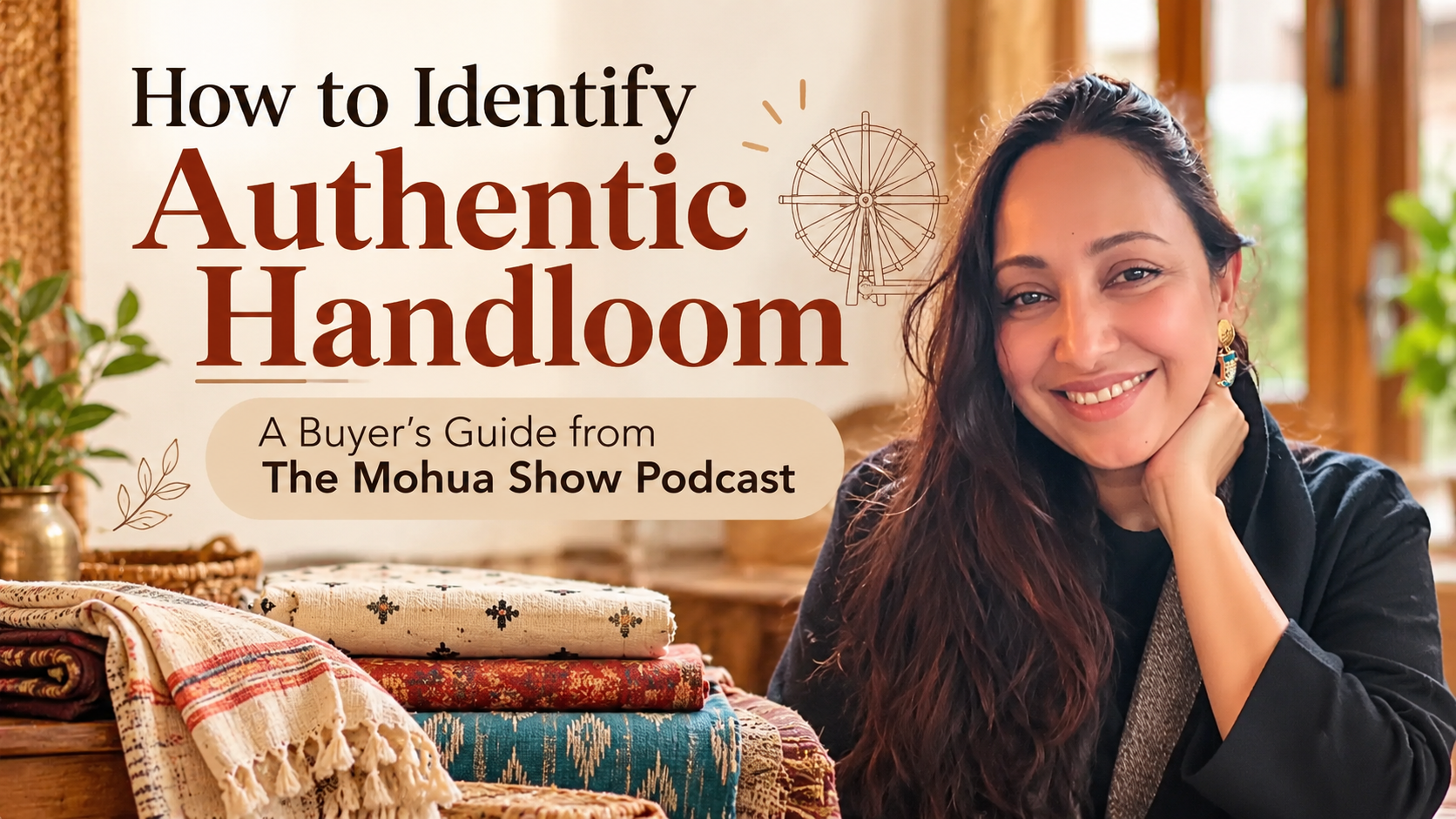
A strong visual identity does not just look good. It communicates what your show is about, who it is for, and why it belongs in someone’s playlist. The Mohua Show’s visual presence, warm, grounded, and distinctly human, reflects exactly what the podcast delivers: honest conversations about real lives. That alignment between what a show looks like and what it sounds like is what great visual identity work achieves.
Why Your Podcast Logo Is More Than a Design Decision
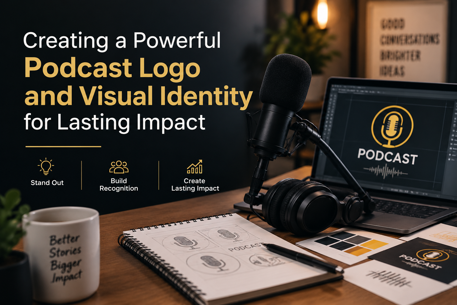
A podcast logo sits at the intersection of brand strategy and visual design. The wrong logo can make a serious show look amateur or a warm, accessible show look corporate and cold. The right logo does three things at once: it identifies your show instantly, it signals your genre and tone, and it works at every size from a tiny mobile thumbnail to a large display banner.
Most podcast logos fail at the third test. They are designed for large screens and become unreadable at the size they actually appear most often. Intricate detail, thin fonts, and complex layouts that look great at full size collapse into visual noise at thumbnail size. Good podcast logo design starts with the smallest size and works upward, not the other way around.
The Elements of a Strong Podcast Visual Identity
A Logo That Works at Thumbnail Size
Your podcast cover art appears as a 3000 x 3000 pixel image in directory specs, but listeners see it at roughly 100 x 100 pixels on their phone. Test your logo at that size before you finalise anything. If the text is unreadable or the image becomes a blur of shapes, the design needs to be simplified. Bold typography, strong contrast, and one clear focal element are the hallmarks of logos that survive thumbnail compression.
A Consistent Colour Palette
Colour is one of the most powerful tools in visual identity. It creates recognition before the eye even registers a shape or word. Decide on two or three core colours and use them consistently across your podcast cover, social media graphics, website, and episode thumbnails. Over time, those colours become associated with your show in your listener’s mind. The Mohua Show’s visual palette signals warmth and depth, which matches what the show actually delivers.
Typography That Matches Your Tone
The font you choose communicates as much as the words you set in it. A serif font reads as established and authoritative. A clean sans-serif reads as modern and accessible. A script or hand-lettered font reads as personal and creative. There is no wrong choice as long as it matches your show’s actual tone. What is wrong is a mismatch. A podcast about grief and healing should not use a font that belongs on a tech startup’s pitch deck.
A Visual Language for Social Media
Your podcast logo is the anchor of a broader visual identity. Beyond the cover art, you need a system for episode announcement graphics, quote cards, clip thumbnails, story frames, and promotional banners. These should all feel like they come from the same place. Same colours, same fonts, same overall visual voice. A listener who finds you on Instagram should recognise your show immediately when they see it on Spotify.
Common Mistakes in Podcast Visual Identity
The most common mistake is treating the podcast logo as a one-time design task rather than the starting point of a visual system. A single great cover image is not a visual identity. A visual identity is a set of decisions, consistently applied, that make your show recognisable across every platform and format.
The second most common mistake is using too many visual elements. Two fonts, three logos, four colour palettes, five different graphic styles across social media. Visual clutter signals lack of intention and makes a brand harder to remember. Simplicity and consistency are always more powerful than variety.
How to Brief a Designer for Your Podcast Visual Identity
If you are working with a designer, the quality of the brief determines the quality of the output. A good podcast logo brief covers your show’s name, topic, and target audience. It describes the tone: is the show warm or sharp, intimate or expansive, serious or playful? It shares reference examples of visual styles you are drawn to and explains specifically why. It describes any elements that are non-negotiable, a specific colour, a specific feeling, a specific element to avoid.
The worst brief you can give a designer is: make it look nice. The best brief is one that gives the designer enough information to make creative decisions with confidence, then trusts them to make those decisions.
Podcast Logo and Visual Identity on a Limited Budget
A professional visual identity does not always require a large agency budget. If you are starting out, a skilled independent designer with a strong portfolio of brand and podcast work can deliver excellent results. Platforms like Dribbble, Behance, and LinkedIn are good places to find designers whose style matches what you are building toward.
Canva and similar tools can bridge the gap while you build budget, but use their templates as a starting point and customise heavily. A template that every other podcast could have used is not a brand identity. An adapted, consistently applied visual system built on a template is something closer to one.
Evolving Your Visual Identity Without Losing Recognition
Brands evolve and podcast visual identities evolve with them. As a show grows and its audience becomes more defined, there are often good reasons to refine the logo, update the colour palette, or modernise the typography. The key is evolution rather than revolution. Sudden dramatic rebrands confuse existing audiences. Gradual refinement that retains the core recognisable elements strengthens a brand over time.
The Mohua Show’s visual identity has evolved since 2020 while retaining the warmth and human quality that defines the show. That consistency is what makes a brand recognisable across years rather than just weeks.
Visual Identity as a Listener Acquisition Tool
Every time your podcast appears in a directory, in a social share, in a newsletter, or in a search result, your visual identity is doing acquisition work. A strong, clear, memorable podcast logo and visual identity makes a browser into a listener. It is not the only factor, but it is often the first one.
Invest in your visual identity as seriously as you invest in your audio quality. A show that sounds great but looks generic is leaving listeners on the table. A show that sounds great and looks unmistakably itself builds recognition that compounds over time. Explore what a strong visual identity paired with strong content looks like at themohuashow.com.
Frequently Asked Questions
What size should a podcast logo be?
Most podcast directories require a minimum of 1400 x 1400 pixels and a maximum of 3000 x 3000 pixels in JPEG or PNG format. Design at 3000 x 3000 pixels and always test how it looks at thumbnail size, around 100 x 100 pixels, before finalising.
Do I need a visual identity beyond the podcast cover art?
Yes. Your cover art is the anchor, but a complete podcast visual identity includes social media templates, episode announcement graphics, quote cards, clip thumbnails, and any promotional materials. These should all use the same colours, fonts, and visual style to build recognition across platforms.
How often should I update my podcast visual identity?
There is no fixed timeline. Refresh when the current identity no longer reflects what the show has become, when it looks dated compared to your competitive set, or when listener research tells you it is creating the wrong impression. Evolve gradually and retain your most recognisable elements.